A few weeks ago the wonderful RWeekly mailing list introduced me to a new type of plot - the point density plot. Wonderfully, the ability to make this plot has been added to the R community in the form of a new package, ggpointdensity.
From the top line description, it’s a cross between a scatter plot and a 2D density plot. The motivation for creating the package and using this new plot is that the points in scatter plots can overlap one another while the alternative density plots lose the resolution given by plotting indiviudal points.
Before I get ahead of myself, the plots look like this:
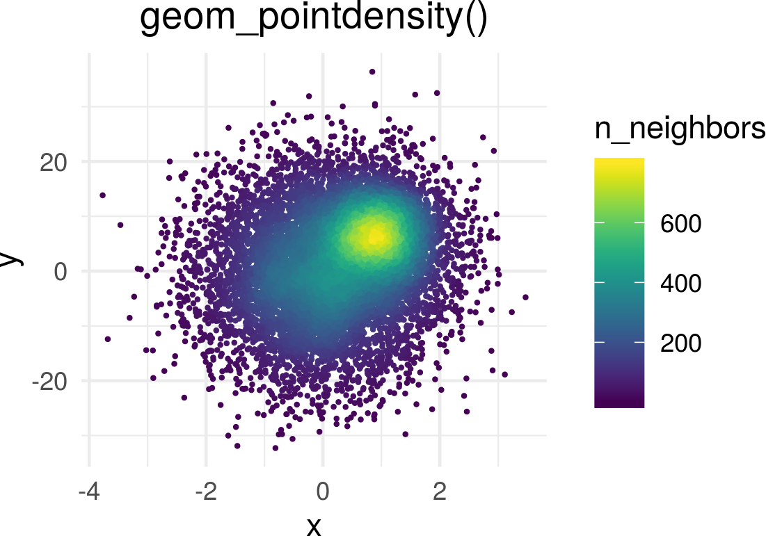
Plot from the package documentation on Github
If it isn’t obvious from the package name (or the image above), this is made to work with ggplot2 and simply adds a new geom, geom_pointdensity().
Each point is colored by how many points are around it.
To further illustrate it, let’s look at a data set I’ve been playing with at work. I’ve been examining school districts around philadelphia and getting information about each one from the U.S. Census American Community Survey. After contacting both the Google Maps API and the US Census API, I found 1,074 school districts within three hours of Philly.
Before using this new geom, I would have probably made this plot:
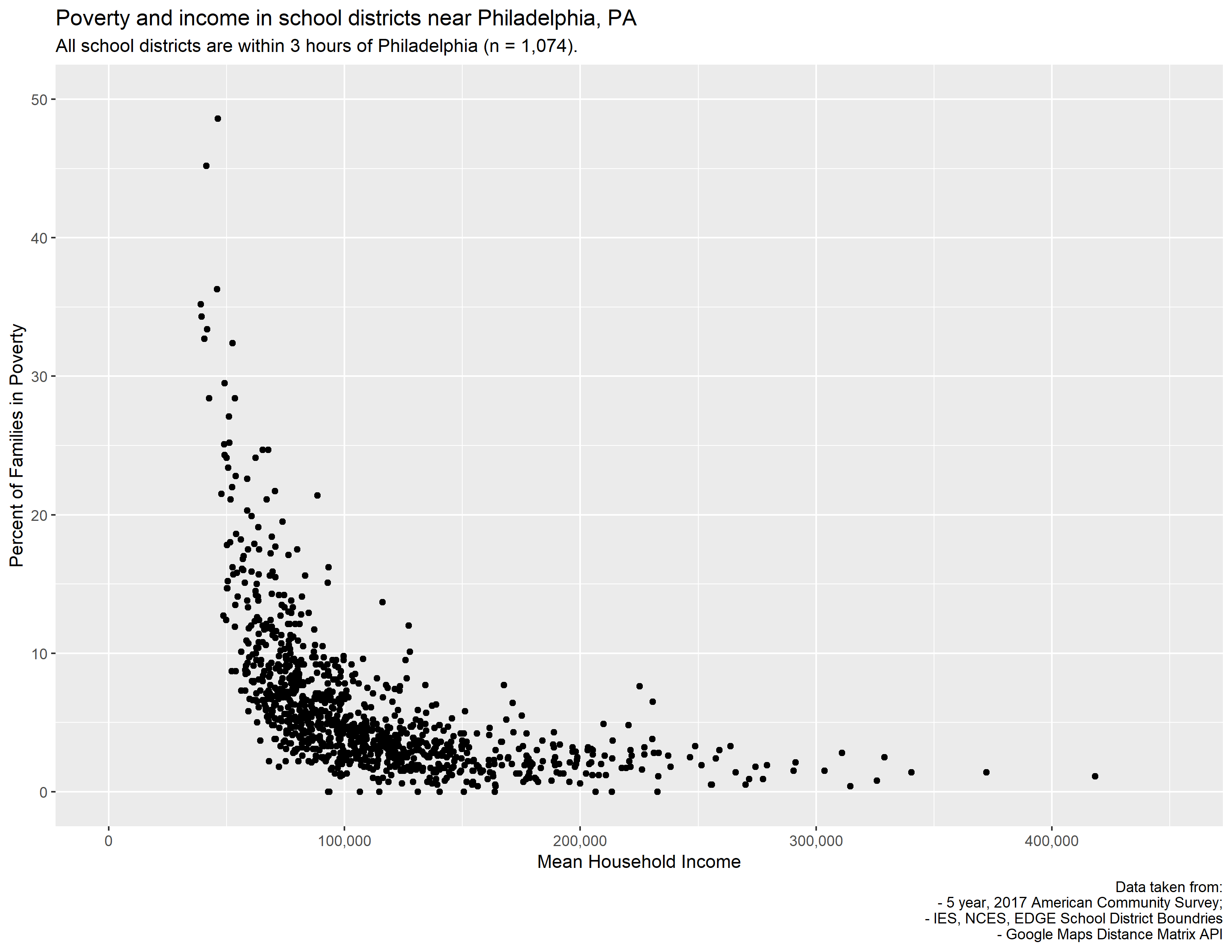
geom_point()
While there are a bunch of districts surounding it, there’s a central feature in the bottom left of the plot where many points are over plotted. To produce that plot I used geom_point(). What if instead I were to use geom_density_2d()?
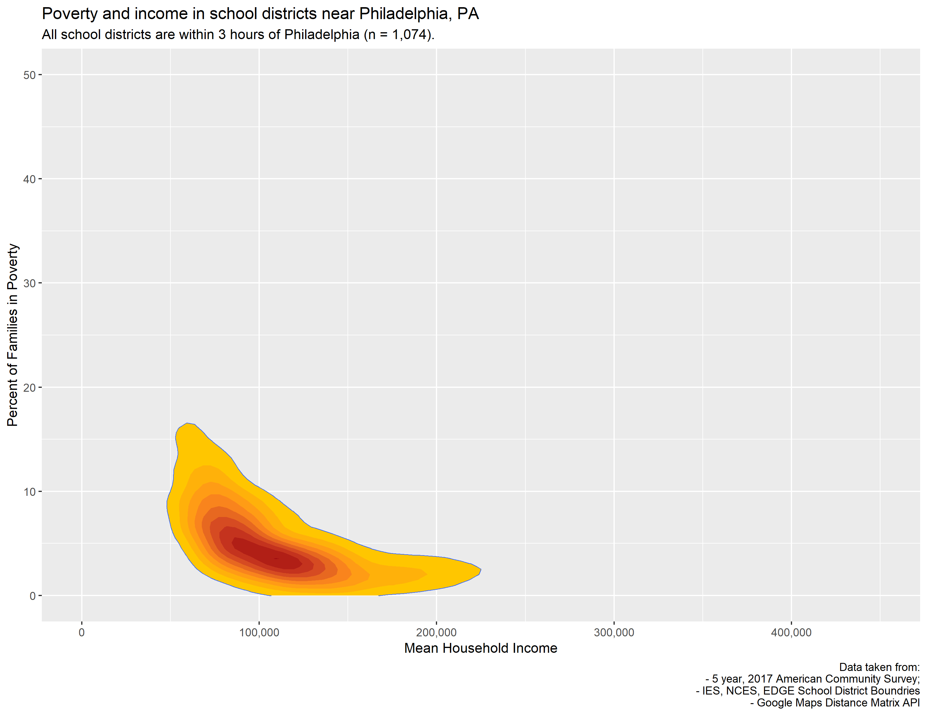
geom_density_2d() + stat_density_2d()
As the package author mentions in their description, you lose the abilty to see outliers. You can certainly see that, as we lost a lot of resolution. Certainly then, we could try to plot both the points and density at the same time…
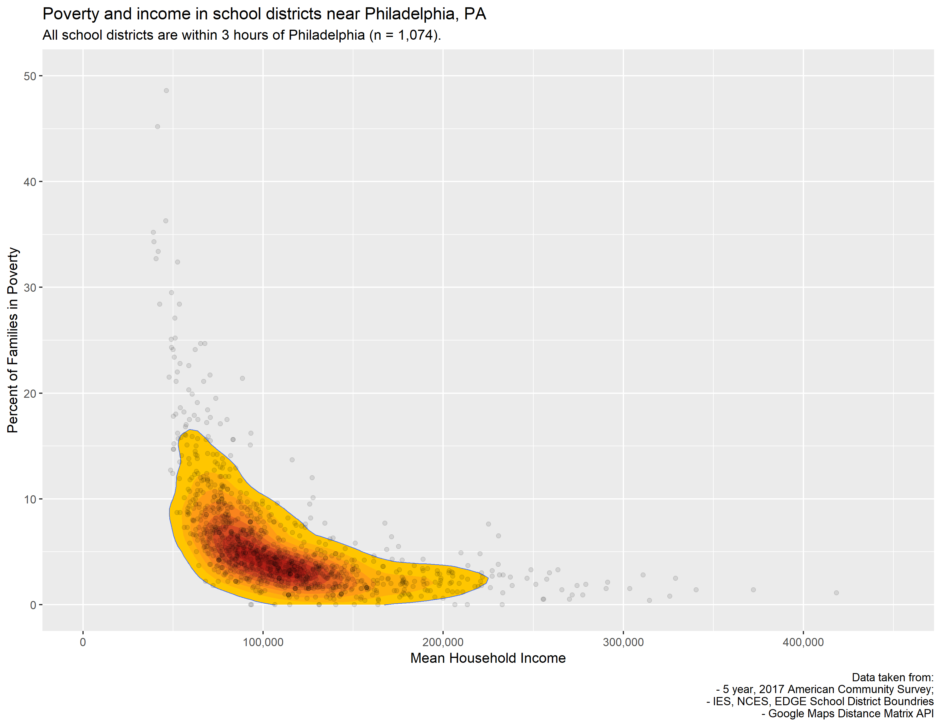
geom_point() + geom_density_2d() + stat_density_2d()
I showed my coworker that one and they said they liked it because it looked kind of like a papaya. I dont really see it but 🤷♂…
Anyway, let’s now visualize this with our brand new tool - geom_pointdensity()!
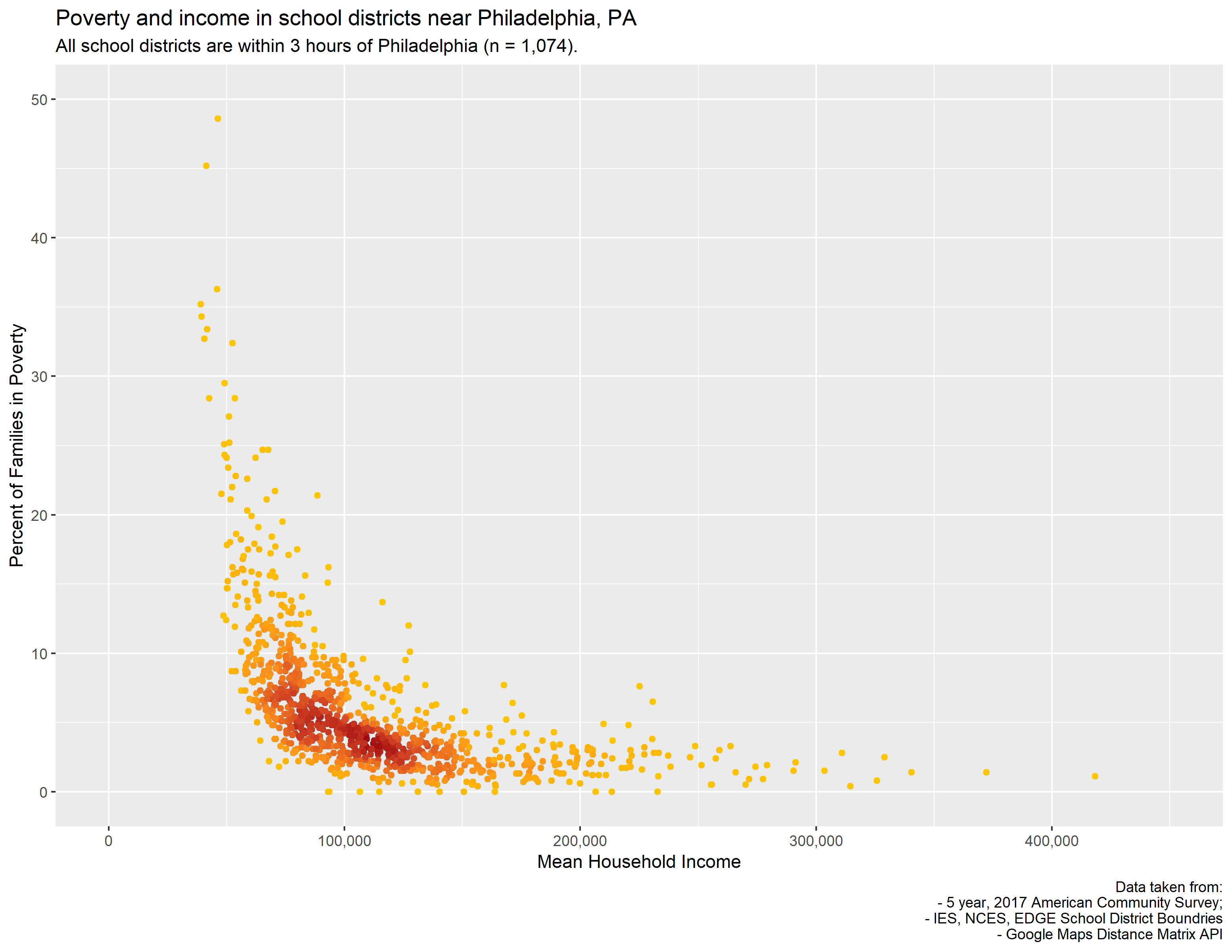
geom_pointdensity()
I like this because you get the high resolution of the dot plot but you can also see where the areas are with the highest density of points.
Also, I think these plots just look really really cool.