I’m slowly working through a new program to formalize and fill-in blanks in my knowledge in working with data. To help me with that, I’ve been searching for a toy data set to use to practice the things I’m learning. I think that I’ve found my data set.
And oh my gosh, this data has depth.
I’ve decided to spend some time playing with Pennsylvania crash data, with data from 2007-2021. The data portal to access the data can be found here.
After downloading a subset of data and the data dictionary, I found what may be one of the most annoying things I’ve found as a data professional:
The data dictionary is a PDF.
PDF’s are hard to parse. This one is particularly hard to parse. It’s hard to
parse because it includes a mish-mash of all different formatting. For example,
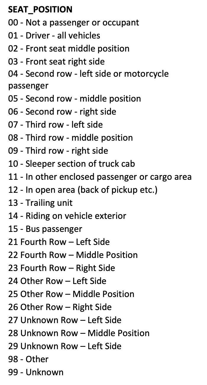
here’s a section that has codes for where a person is in a vehicle. Note a
code-value pair split over multiple rows and note how some code-values are
separated with a -while others are not. Also note how some values have dashes
in the value.
What all of this means is that the codes and dictionary values are hard to parse into a tabular format that can then be plugged into analyses and visualizations later on in analyses.
I’ve converted the pdf data dictionary to a tabular format here.